GIF image credit, Future Brand
Case Study American Airlines | AA.com
UX Research | UX Design | UI Design
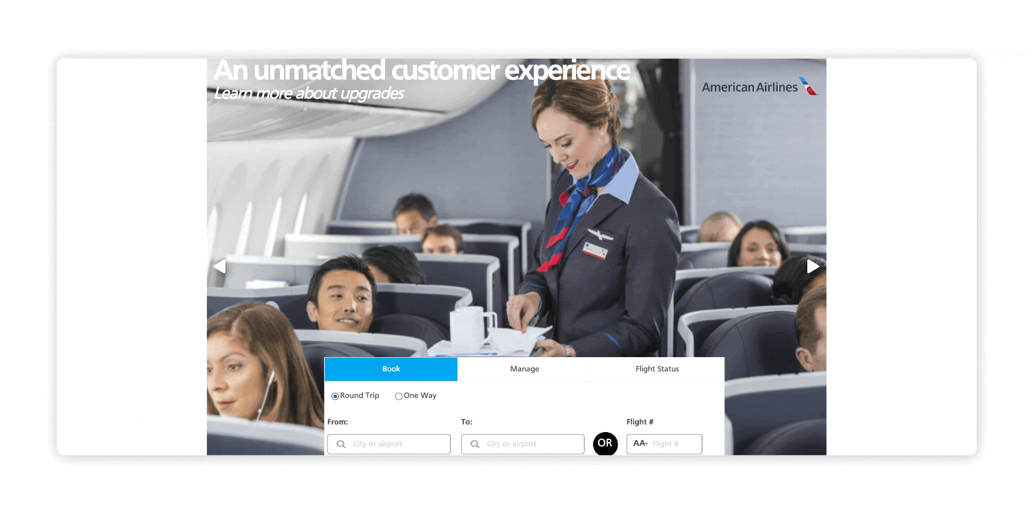
This personal case study expresses my interest in aviation and the travel industry.
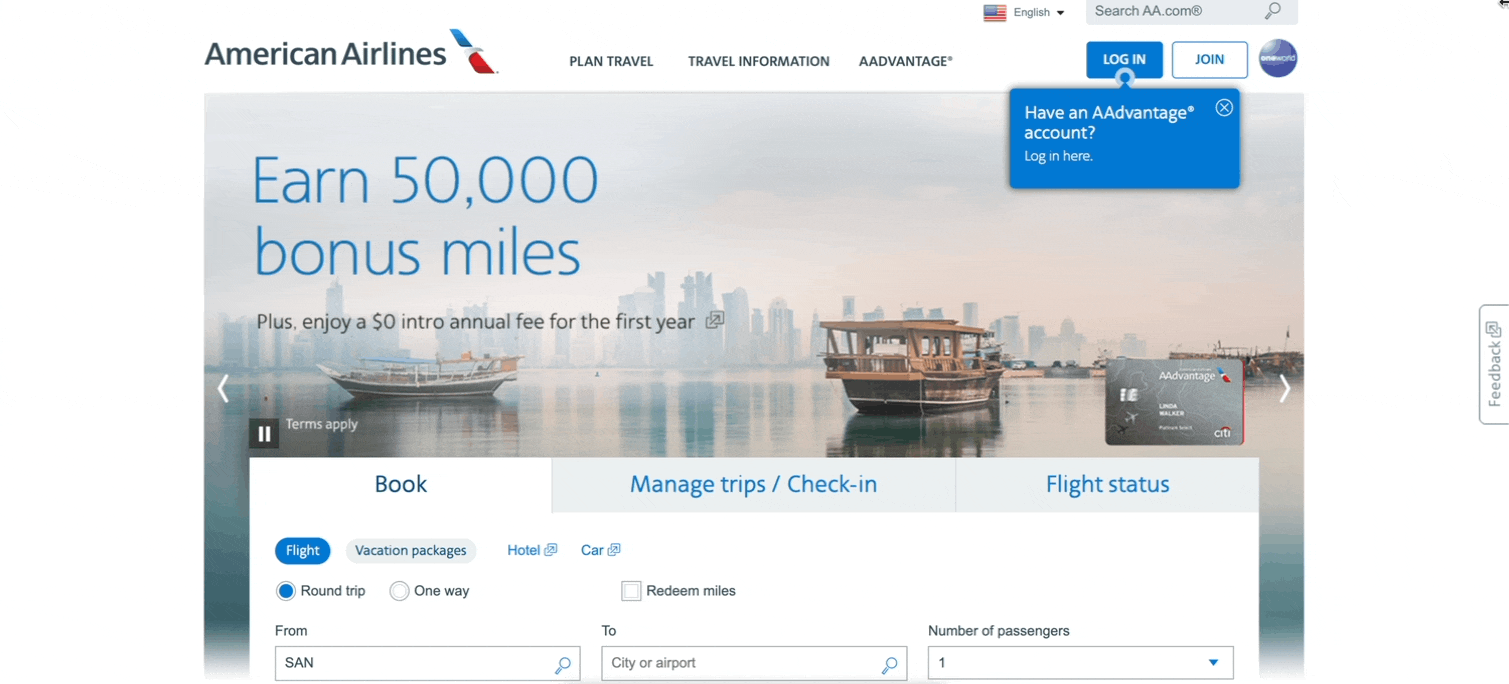
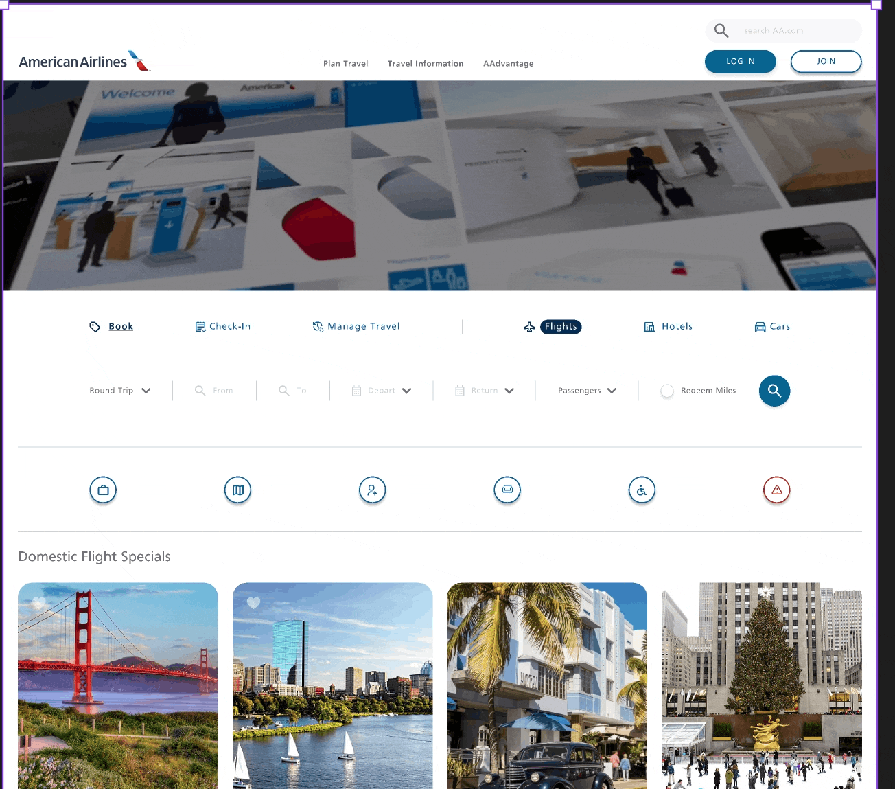
Identified three problematic areas of usability on American Airlines’ Website.
Arranged contextual interviews for an unbias assessment of usability.
Synthesize my solutions with functional, interactive prototypes using data compiled from my findings.
Followed up with interviewees for additional testing, iterated, and made revisions based on feedback.
Problems Identified.
-

Booking Confidence
A look into alleviating pain-points in the booking process.
-

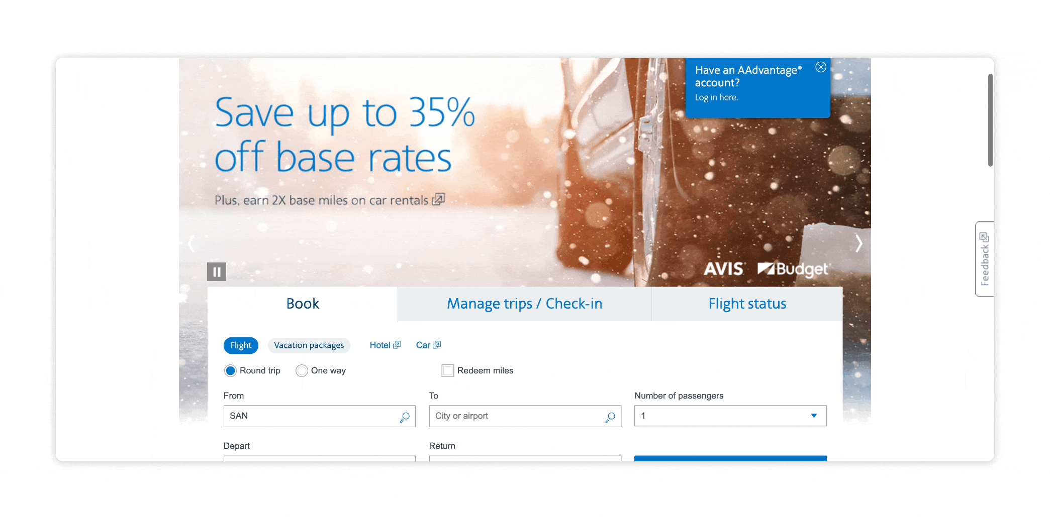
Baggage Cost Options
The dated chats explaining baggage information on the site requires time and precise knowledge from travelers.
-

AAdvantage Points & Members Portal
There is a disconnect for AAdvantage members using points. The members portal lacks cohesion to the rest of the site.
Solutions to test. | Booking Confidence
-
I wanted to emphasize the ability for additional help directly from AA. I’ve implemented AI help messaging that can be accessed from each page.
-
I added an input on the booking dashboard where flyers can enter their flight number, refining the search to find the desired flight.
-
Flyers can share the selected flight via email by clicking the “share” button on within the selected flight information.
AI help prototype
Book by flight number prototype
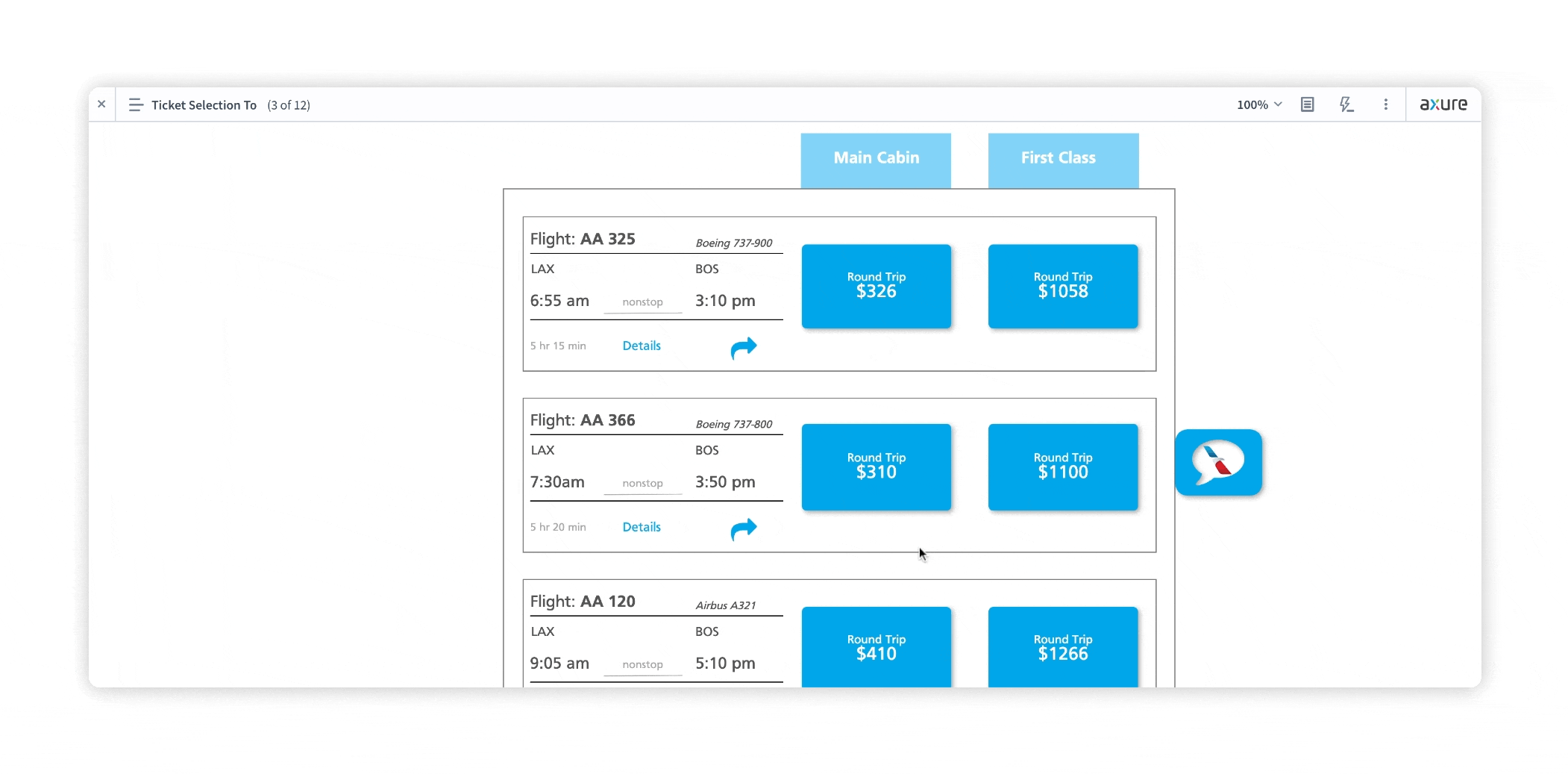
Share flight prototype
Solution to test. | Bags, Options, and Fees:
-
AA’s baggage information is sporadically laid out throughout the site. I felt this was an excellent opportunity to design a tool to help flyers get final pricing on their luggage.
The baggage calculator allows flyers to choose both checked baggage and specialty items and the quantity desired for the trip. The departure city, destination, and route type are selected for a final breakdown of the luggage cost. This tool alleviates the time it takes to look through the bag charts and is designed to provide quick, clear information without the inefficiencies from the charts.
Bag calculator prototype
Solutions to test. AAdvantage Portal (Frequent Flyer Program)
-
After conducting a contextual inquiry with AAdvantage members before the re-design, it was apparent that members only knew the “ins and outs” of AAs frequent flyer program due to being savvy travelers.
The booking interface in the AAdvantage portal did not share any consistency with the booking interface on AA’s landing page. I felt using the same elements, and design language from the interface used on AA’s home page was best. Keeping consistent layouts/tools will familiarize users and drive greater success with accessing information and navigating through the site.
-
With the AAdvantage portal on the website lacking what members needed, I felt it was necessary to redesign both the layout, elements and call-to action points associated with the portal. The page opens with a booking interface that mocks the default home-booking interface but aims to book with rewards miles.
The tabs above link to the primary tasks for AAdvantage members. These tasks include the booking interface, account page, and promotions. Tabs on the underside link to tasks of secondary importance: buying/gifting additional miles, upgrading flights with miles, and link to booking with AA’s interactive rewards map.
-
This is a powerful tool that AA is not utilizing on any of their pages. I wanted users to know more about it, hence having two options to access this tool. The new design language closely follows AAs home page, whereas their current portal does not mirror it. Promotions show members the ongoing deals that are happening for the year. I also designed a simple upgrades calculator for flyers to clearly understand the additional points needed to upgrade their booking.

AAdvantage Portal Flow
Learnings. Remove, keep and improve.
AI help. Remove
Testers provided information that AI chat-bots can be helpful however, 80% of testers said they would not use an AI Help bot base on unsatisfactory past experiences.
Booking by flight number. Remove
Testers found this idea to be novel but not useful due to the unfamiliarity. This feature also gave users another piece of information to focus on. Less is more.
Share flight information. Keep
90 % of testers found this feature to be useful with a variety of different use cases.
Baggage Calculator. Keep & Improve
Every tester found the calculator to be much easier to find bag costs for specific flights.
Some testers mentioned that cognitive affordance could be optimized with fewer drop-down menus and better information architecture.
Interface consistency. Improve
(10 laws of heuristics) #4 Consistency and standards. Testers agree that uniform Visual Design and UI make for a more intuitive experience.
Transforming from adaptive to responsive.
Second iteration challenge. Design a responsive layout with improved aesthetics and minimalism. Embrace space, information, and flow.
Second Revision | Baggage Calculator.
Grouped each bag category and linked specific bag information in modals.
Used input steppers to add bag units to reduce the number of drop-down menus.
before.
after.
Style Guide, Design System & Interactive flows